


MHCBE has a new look!
Posted on May 13, 2021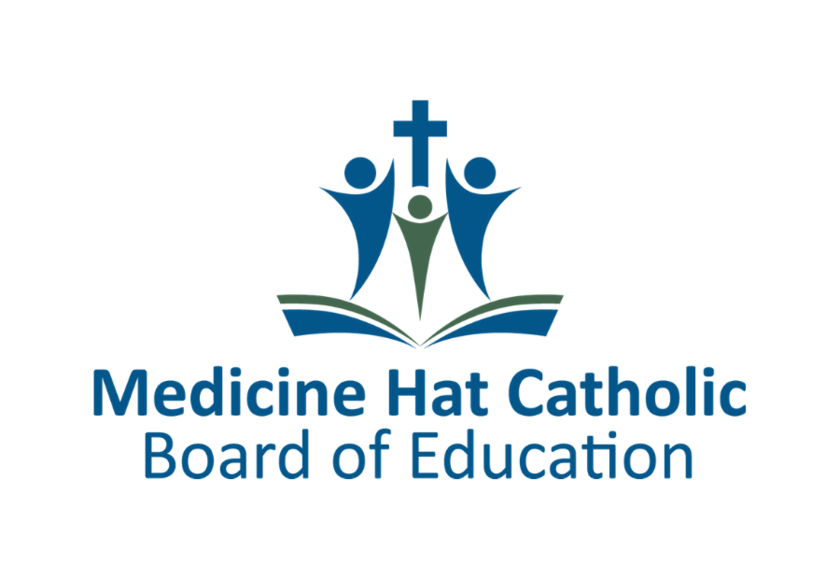
The Medicine Hat Catholic Board of Education is updating our look with a new logo.
Emphasizing the combination of faith, families and staff, the new brand shows how the school division supports students with quality education as its foundation.
The logo replaces a version featuring a cross, a Bible, and a candle lit by a guiding hand which has been a mainstay for decades.
“Our logo is the most visible representation of our division,” says MHCBE superintendent Dwayne Zarichny. “I am incredibly proud of our new logo as it captures the essence of who we are and what we believe is most important.”
Unveiling the logo on May 13 is important because it coincides with World Catholic Education Day. The main colour of the division — blue — symbolizes Catholic education in Alberta.
One modern feature of our design is that the secondary logo colour can change based on the liturgical calendar. In ordinary time that means green, but versions of the logo will also show purple and gold. Green represents hope and life. Purple is used during Advent and Lent, and describes times of preparation, penance and sacrifice. Gold is used during Christmas and Easter and symbolizes glory, joy, innocence and purity of soul.
Staff and students are encouraged to take some time today to view the following video and share their feedback on social media with the hashtags #WeAreMHCBE and #IBelieveinCatholicEd.
Medicine Hat Catholic Board of Education unveils new logo - Chat TV
Catholic board’s new logo tells a story - Medicine Hat News